Oculus Weather
An architecture-inspired, minimalist weather app
Roles: Product Design | Front-End Development


Winter 2020
Time: 2.5 Months
Project Type: Front-End Development, UI Design
Personal Project
Live Demo: Oculus Weather (Requires Geolocation)
In a sea of cluttered weather applications, Oculus Weather delivers you the information you need in a dynamic and minimalist package. Inspired by the architectural oculus, an opening in the wall or sky, this weather visualizer brings outside conditions into your virtual space.
Technology
React
Netlify
D3
Javascript
Sources & Citation
OpenWeather API
CodePen (CSS Animations)
Define the Problem
Current weather apps display too much information in a cluttered user interface.
Apps should display both graphical and empirical weather data in an elegant, organized way.
This product exercise would provide an excellent opportunity to learn React, CSS animations, and D3.
Weather Animations (CSS) - Day & Night
-

Clear Sky
-

Few Clouds
-

Scattered Clouds
-

Broken Clouds
-

Overcast
-

Drizzle
-

Rain
-

Thunderstorm
-

Snow
Introduction
Existing Conditions: Banana Icons & Other Sins
In today’s digital interfaces, users are overwhelmed by a clutter of information and an endless stream of spectacle. The conventional approach to user interface design is to treat applications as beautifully decorated pages, functional charts, and documents. The overwhelming quality of data, in its fullness and comprehensiveness, creates “maximalist” experiences and draws the user’s attention.
While this approach creates fun designs and spectacles, it can also result in cluttered designs with a lack of elegance and restraint. In the world of weather apps, you may find endless rows of dates and information, or fun small animations. Often, applications rely on tried and true weather icons as fallback, which can feel cartoonish and difficult to understand. (For instance, I cannot “un-see” the banana-shaped, gold-yellow moons. They look and suggest bananas.) Rather than relying on icons and cartoons for communication, can a weather app simply convey the feeling of the weather in a more elegant way?
Outlines and Goals
Design Objectives
Graphic Hierarchy
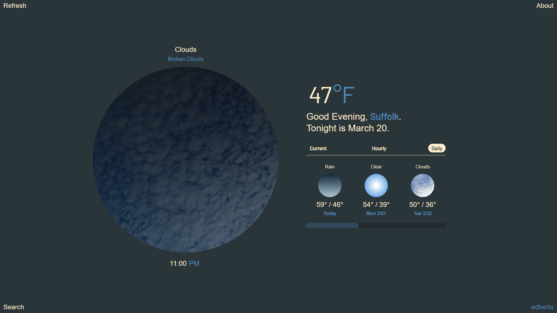
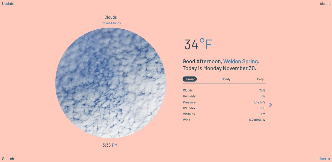
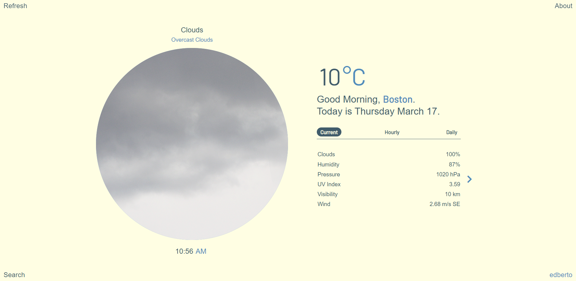
The user interface has clear graphic hierarchy and legibility. Weather visualization expresses the qualitative feeling of the weather, and weather data indicates the quantitative functional data. Information scale and placement directly relate to the information presented, and only the most important data is shown.
Meditative Animations
Weather visualization fully utilizes the potential of CSS animations. Visualizations convey weather events realistically and comfortably, based on the weather conditions provided by external API.
Responsive Design
Project contains response design that scales well across screens and devices (desktop, tablet, and mobile). Design responds to changing weather information and local time of the user, through lighting and visual changes.
Development Guidelines
External API
The project uses an external API to bring in weather data and maintains information in state. Application identifies user's location through browser geolocation. Data includes local, hourly, and 7-day information.
React Reusability
Application uses React as a front-end framework. Data from API moves uni-directionally from the container state to smaller components, and user events flow the other direction. Whenever possible, data logic and components are reused to prevent redundant logic. Application folder structure and file information are clear.
D3, React Hooks
For learning and experimentation purposes, project utilizes D3.js for data visualization for some displayed information. React Hooks are also explored whenever possible.
Concept & Design
The Changing Sky
Since recorded history, the sky has been a constant source of fascination for all people everywhere. With its ever-changing conditions of light and color, the sky has a spiritual way of connecting humans to nature and the wider cosmos. The weather represents more than functional information, telling us how to dress and when to go outside. It is ultimately a thing of beauty, and nature itself.

Architecture and Art Precedents
Initial Sketches
How can the interface itself express the weather? My first thoughts went towards Mark Rothko’s minimalist paintings, such as his No.1 (Royal Red Blue). The modern painter once said that a “painting is not a picture of an experience, but is the experience.” How can I imbue that same spirit to the app? The key was not to merely overlay the weather text and data on top of the image, but rather celebrate the image itself, as the icon and experience. The architectural oculus serves this role beautifully.

Wireframing/Prototype
In Chinese philosophy, the square and the circle are fundamental shapes, symbolizing the Earth and the Sky. In the same way that the oculus will visualize weather conditions, a text square will indicate requisite information. The relationship between the two shapes determines the responsive design, in both portrait and landscape orientations. For the data portion, shifting panels will indicate current, hourly, and daily information.


App Production & Refinement
App Architecture


Weather Conditions
Inspired by James Turrell, I crafted oculus animations that celebrate moving clouds, falling precipitation, and thunderstorms. To begin, I tested animations in CodePen and referenced some great front-end examples. I corresponded each weather condition to Open Weather’s own set of orange-and-black icons. For further study, I imagine that the app’s visualizations can be further attuned to the 50+ unique weather conditions.

Colors of the Day
As a final touch, the background and text colors dynamically change based on the user locations’ time of day. Here, I was inspired by Olafur Eliasson’s Color Experiments. The app’s changing color theme seeks to match the circadian rhythm of the user, changing to darker, cooler colors at night and warmer, lighter tones during the day, every two hours.


